LG.
Bringing a smile back to tech.
LG Electronics needed to rejuvenate its brand. It needed to feel more youthful to appeal to a new generation of consumers, and be flexible and expressive in both physical and digital spaces. Expanding its reach beyond the home and way beyond hardware - helping to reimagine every side of life - and injecting fresh meaning into its world-famous tagline: Life’s Good.
LG's brand value surged by 38.7% - LG's engagement across digital platforms increased by 555%, with Instagram followers growing by 16%, indicating a stronger connection with global audiences. LG was listed in the top 100 "Best Global Brands" list in 2024 for the first time.
See more here: wolffolins.com/work/lg-electronics
Leeum Museum.
Putting the art museum in motion.
The Leeum Museum of Art in Seoul, run by the Samsung Foundation, has built a respected collection of Korean and international art since opening in 2004.
Following the pandemic, the museum sought a new brand and experience vision to reflect its ambition to become a 21st-century space of cultural convergence — where traditional, contemporary and global art could be seen and discussed together.
We created a new identity centred around a dynamic, rotating logo inspired by the museum’s Rotunda — symbolising the cyclical, ever-evolving nature of art. The system was designed to be flexible, supporting diverse exhibitions and experiences across every touchpoint, from signage to social media to AR — encouraging active participation, not passive viewing.
See more here: wolffolins.com/work/leeum

Mercedes-AMG Petronas F1 Team.
All in: building a team identity and performance-driven mindset.
When you get asked to help one of the world’s most iconic sports teams it’s a scary but awesome feeling. I led the development of a new team identity that honored this legacy while projecting its ambition for the future. Working direct with the owners and board - this included creating a new unified team ethos, team symbol, a comprehensive design and messaging system from comms to social to business, new bespoke typefaces and refreshed identity, and a bold physical and digital design language. I also had the privilege of designing the new livery for the F1 cars, which generated significant buzz across both design and motorsport communities and was named a new benchmark for the sport. In addition, we help to create the refreshed Mercedes merchandise and fan range.
See more here: wolffolins.com/work/mercedes-amg-petronas-f1-team
BBC.
One BBC - from street to screen.
The BBC hadn’t refreshed its design in over 20 years. Built up over decades, it had become a fragmented patchwork of sub-brands and systems. Research revealed that audiences found the experience outdated, difficult to navigate, and were seeking something more modern and intuitive.
Partnering with the BBC, we developed a new vision that embraces all genres, lifestyles, and platforms. The entire brand system was reimagined to be AAA accessible, seamless across services, and rich in storytelling—visually, sonically, and through service design—delivering a more immersive and future-ready experience.
As well as being part of this rebrand and replatforming, I led the teams to evolve the new brand specifically for the US market, creating a tailored subbrand system focused on North America.
The rebrand was also key to supporting the BBC’s strategic ambition to expand its digital footprint, particularly in North America. I contributed to the relaunch of BBC.com and the BBC app, creating a more modern, intuitive design that better attracts and engages international audiences, ensuring the BBC remains a trusted and accessible source of news and entertainment in an increasingly digital world.
Instacart.
From grocery app to delivery leader
Instacart had been growing continuously since 2012, leading the grocery technology space in the US and Canada and making waves as a rising star of Silicon Valley. Then the pandemic transformed the delivery space overnight. As shopping suddenly went more online than ever, Instacart faced a rising tide of competition. The business needed to evolve—and the brand needed to set the pace. By harnessing the emotional impact that delivery makes in people’s lives, we helped Instacart expand its reach beyond groceries into the wider world of delivery services.
153% - increase in online mentions, Instacart reported a total an 11% increase of revenue and 10.2% Gross Transaction Volume (GTV) after the rebrand. Overall - The rebrand led to a 140% increase in unaided brand awareness and a 66% lift in brand consideration
See more here: wolffolins.com/work/instacart
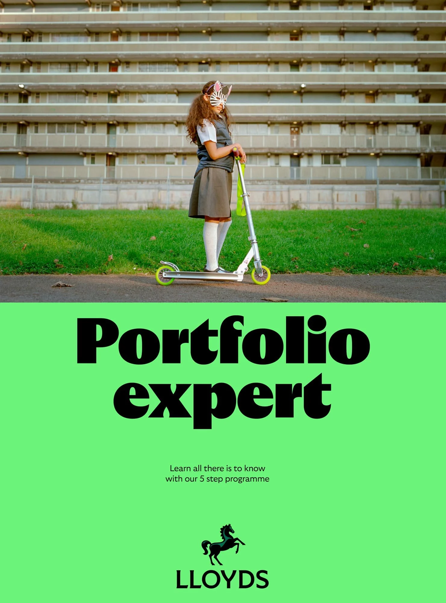
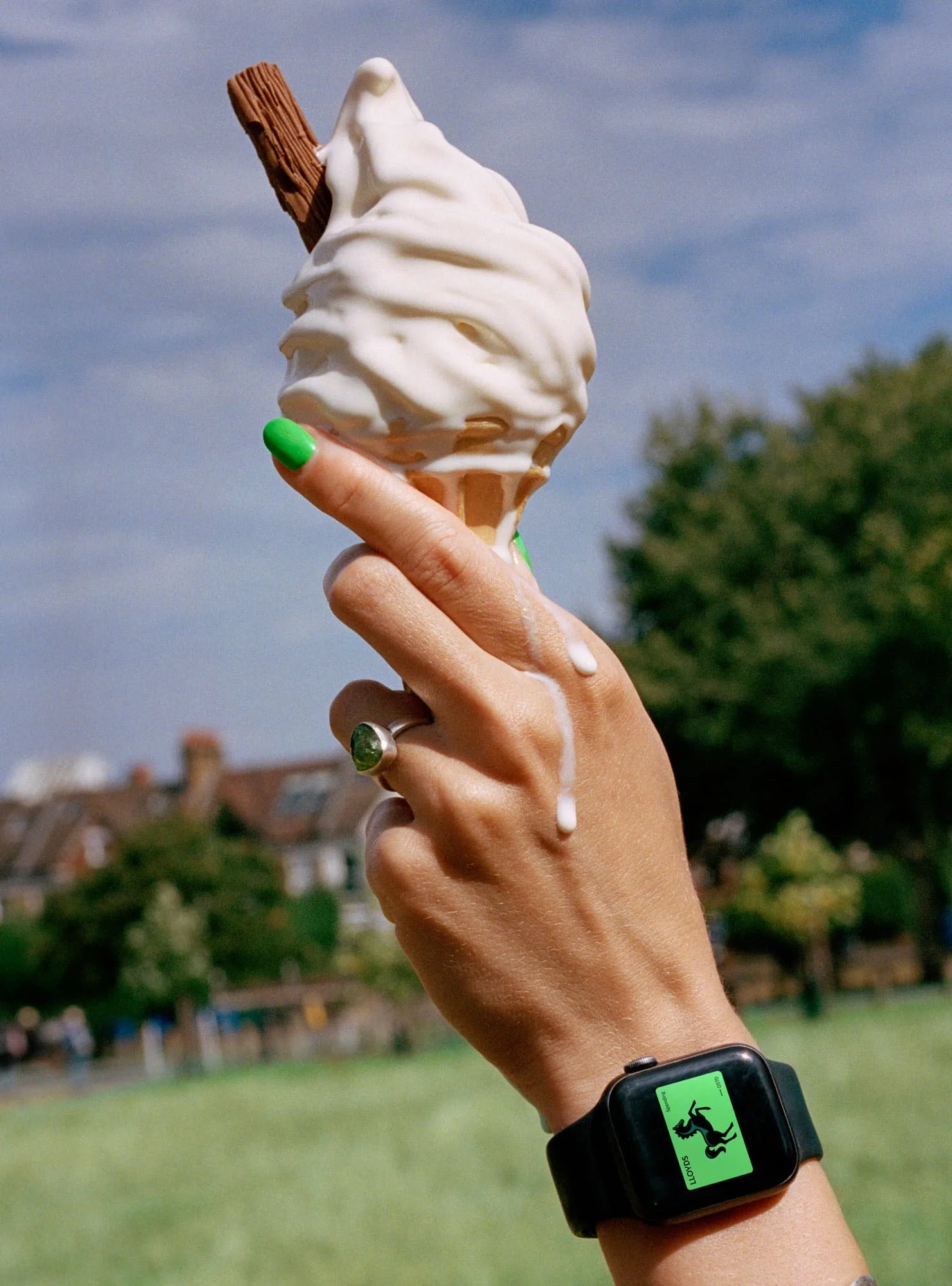
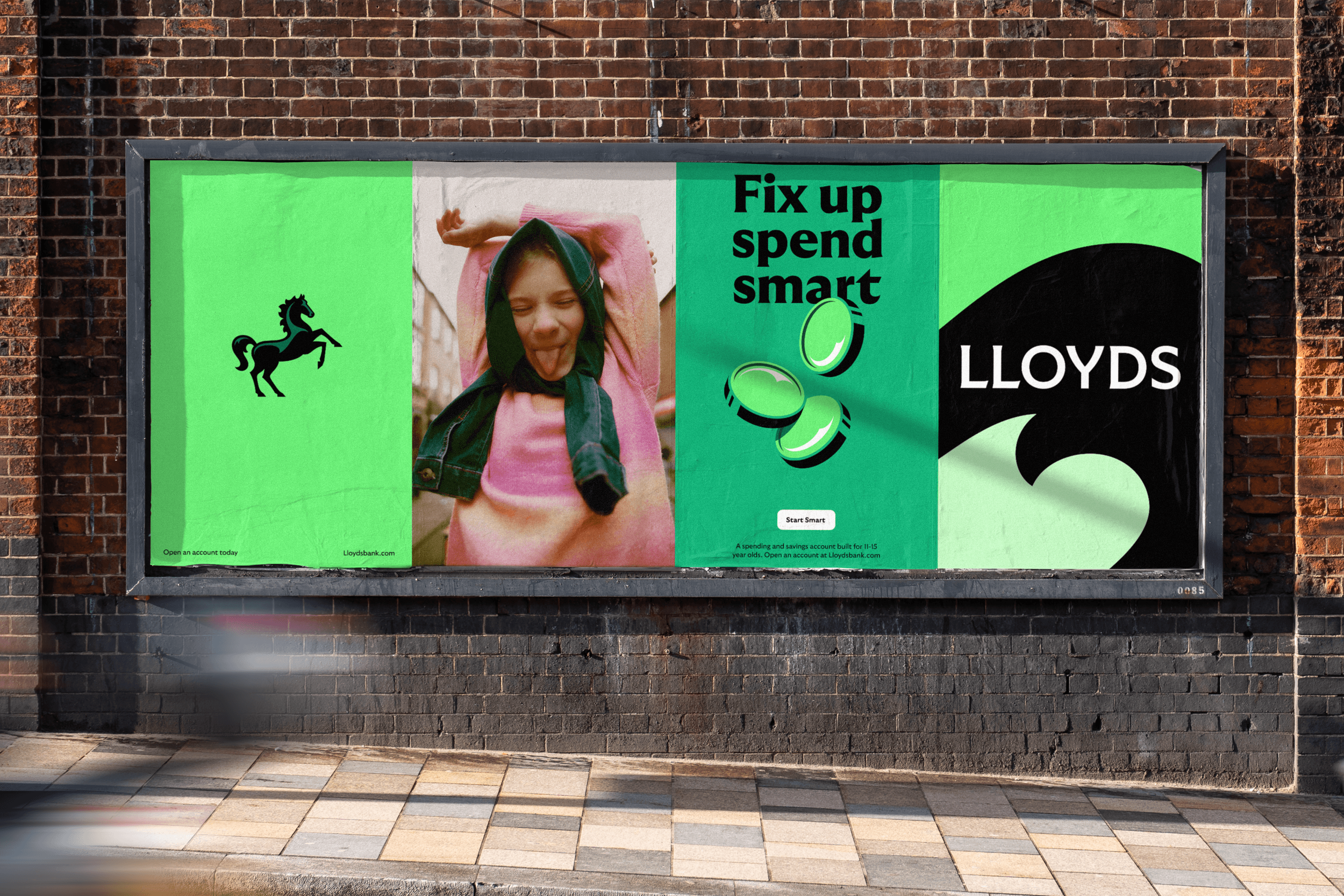
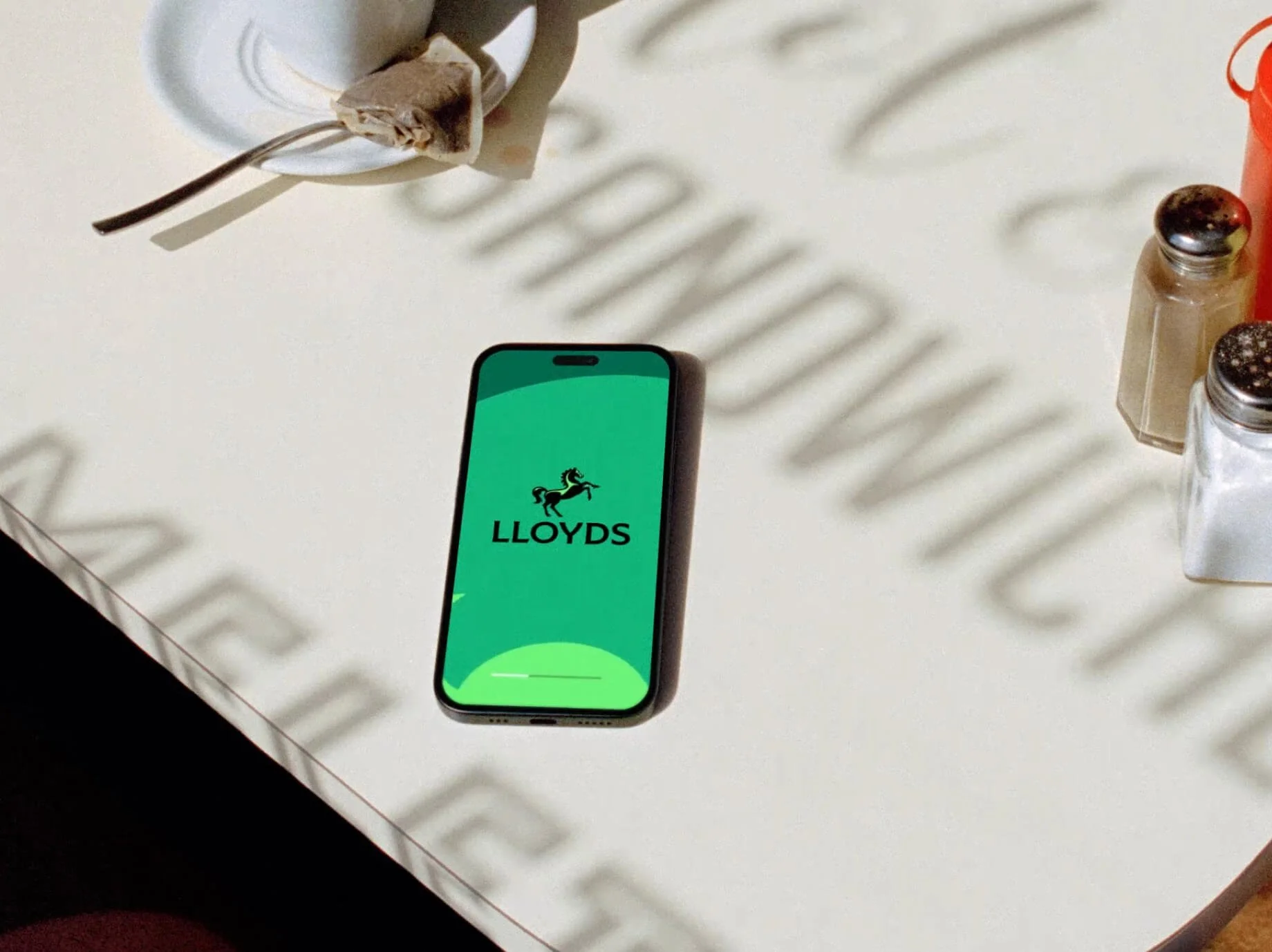
Lloyds.
The next step forward.
I led the team that reimagined Lloyds as a brand built not just to communicate — but to operate. More than a redesign, this was about creating a brand operating system: one that unifies experience and visual design into a single, adaptable platform for transformation.
We began by building on Lloyds’ corporate purpose, Helping Britain Prosper, and reframing it for today’s world. The refreshed mission — Lloyds moves everyone forward — was grounded in a key truth: while everyone has a next step, not everyone feels able to take it. This became the strategic core of the brand — guiding product innovation, customer journeys, and service design across both B2C and B2B.
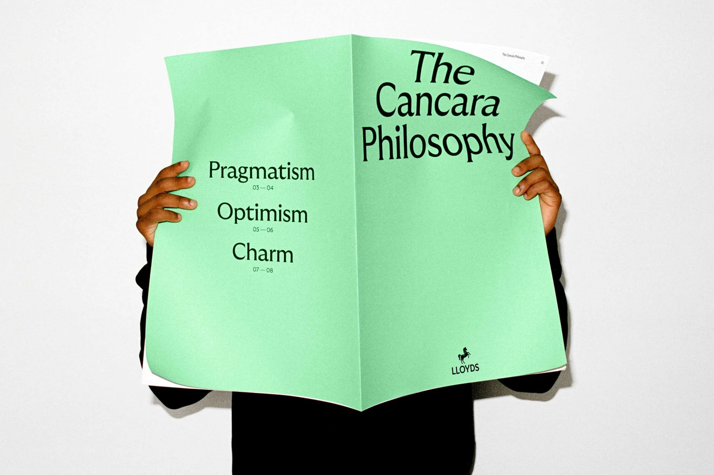
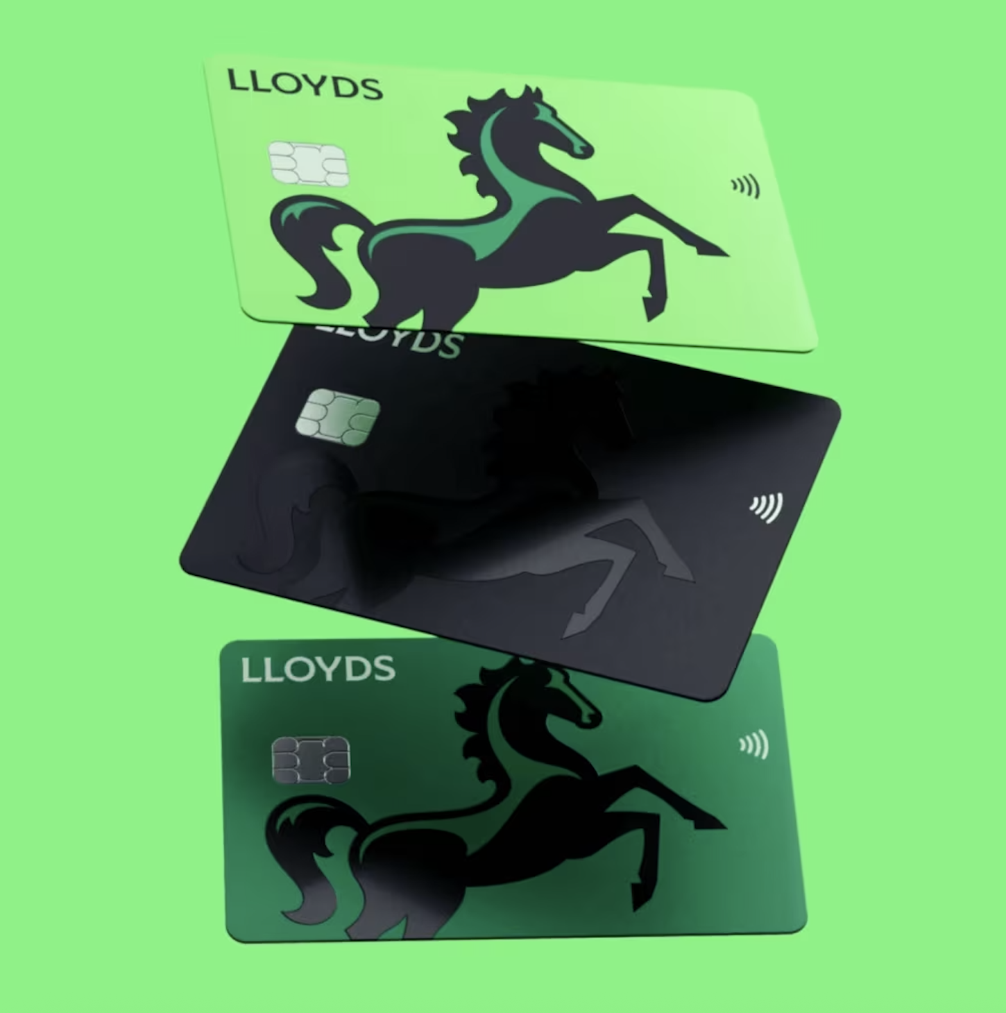
To bring it to life, we developed The Cancara Philosophy — a design system named after the original black horse. It unified identity and experience under a single idea: motion. From the reimagined, semiotically accurate horse mark to dynamic digital behaviours, every element was built to signal progress.
We introduced a customised GT Ultra typeface inspired by early British forms, refreshed the Lloyds green to evoke the UK landscape, and defined a grounded, modern tone of voice. Visual design, motion, language, and photography were all synchronised — not as assets, but as part of a connected system.
The redesigned Lloyds app became a flagship expression of this approach — bringing the full Lloyds offer under one roof, and giving customers a holistic, empowering experience of their finances.
This work laid the foundations for a truly integrated brand — one that acts as an operating system for the business, always evolving and always moving forward with its customers. It has been recognised by the banking press as the best-in-class bank rebrand of the last decade.
See more here: wolffolins.com/work/lloyds
Nothing.
Making Nothing into something
I played a key role in defining and launching the Nothing brand, helping to shape its unique identity in a crowded tech landscape. By collaborating closely with design, marketing, and product teams, I helped craft a brand narrative that highlights Nothing’s commitment to joyful, human-centered technology. Together, we developed clear messaging and visual elements that resonate emotionally with a community eager for innovation that breaks the mold—bringing to life a brand that feels authentic, impactful, and refreshingly different from the giants in the industry.
Sandals.
Rooted In Caribbean Soul
The Rhythms of the Islands
We amplified what was always true: the unshakable pulse of the islands. The sights, sounds, and rhythms that make you breathe deeper and move slower. This spirit, called Natural Vibrancy, now guides everything the brand does—how it behaves, moves, sounds, and welcomes you in.
Our collaboration refreshed and extended what was already iconic, bottling the feeling of the Caribbean: dazzling blue seas, sun-warmed limestone, and familiar smiles. We built a visual and verbal language around that feeling with bespoke typography inspired by Sandals’ heritage, unposed photography, playful iconography, and a voice that speaks like a local eager to share hidden gems.
Amplifying What’s Always Been Felt
Great brands aren’t just seen; they’re felt. Together we turned every touchpoint, from signage and keycards to architecture, into storytelling moments that celebrate the region’s textures and colours. Guided by Natural Vibrancy, we imagined new services, environments, and experiences that deepen each guest’s connection to the islands.
Building on a Legacy
Our work became the foundation for a global campaign spanning TV, print, digital, and social. Training, tools, and templates empowered partners and teams to express the brand more fully. The family spirit and pride behind Sandals and Beaches continue to fuel something greater than a brand: a living legacy, now entering its next chapter.
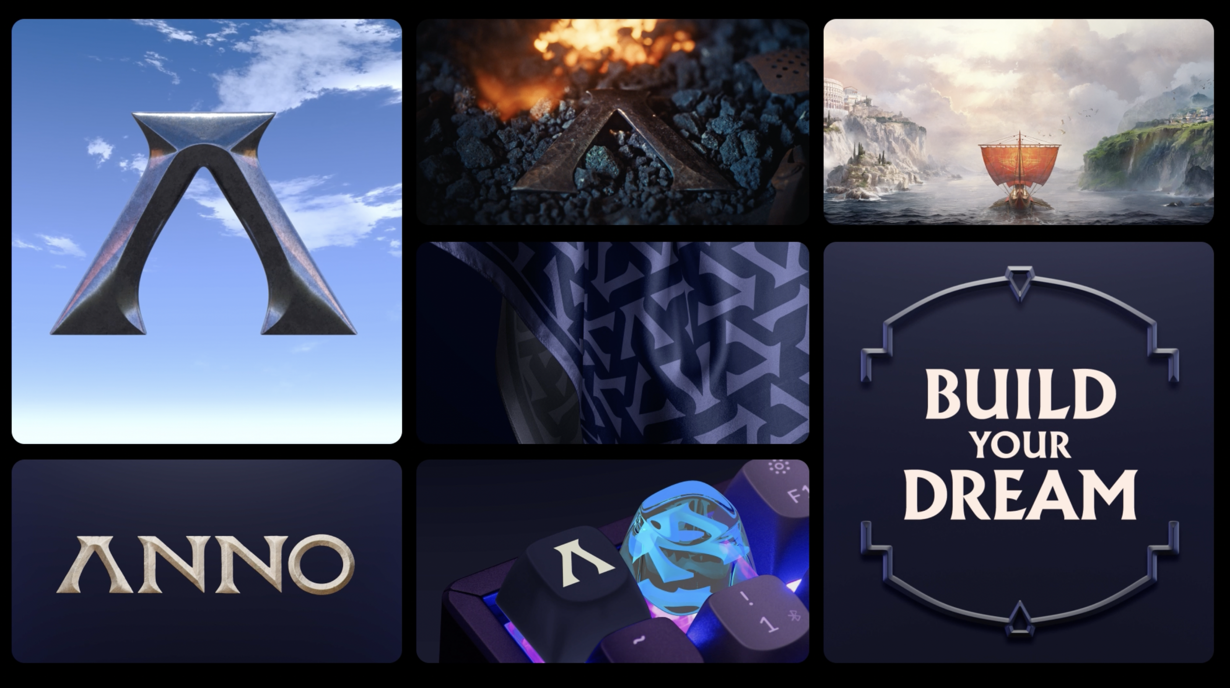
Ubisoft Anno.
A digital game built from raw materials and ancient craft
I was fortunate to lead the first major rebrand of Anno, Ubisoft’s flagship city-building game, reimagining it to “spark the desire to build.” After 25 years and seven instalments, Anno had secured its place as a genre leader, but lacked a cohesive brand purpose and design system.
While the industry moved towards digital and AI, we returned to the roots of the builder genre—craftsmanship, tradition, and the joy of creation. Guided by the brand ethos Crafted with Care, the new identity champions the freedom players have to shape their own worlds.
The redesigned ‘A’ mark embodies the spirit of the Anno community—blending craftsmanship, ambition, and human creativity. In collaboration with metalsmith Owen Phillips, we hand-forged a physical version from raw materials, using the process to inform the design of the digital symbol with authenticity and precision.
Every visual detail—from material textures to the new in-game cursor—is crafted to inspire creativity and reflect the many historical settings of the game. The brand colours draw from classical references: core tones like Bronze Blue and Stone evoke universal building materials, while release-specific hues such as Tyrian Purple and Plum are rooted in the Roman Empire era.
Together, these elements form a refined, adaptable identity that celebrates craftsmanship and brings Anno’s purpose to life: the joy of building.
Besides all the commercial impact it did for the business - it was great to have the recognition across design and gaming - It’s Nice That’s Top 5 Branding Moments of 2024 for ‘redefining what gaming aesthetics can be’.
106% - increase in brand engagement compared to previous Anno game reveals. Audience Engagement - 92% positive community sentiment at reveal. Audience Engagement - 245% increase in press coverage
See more here: wolffolins.com/work/ubisoft-anno
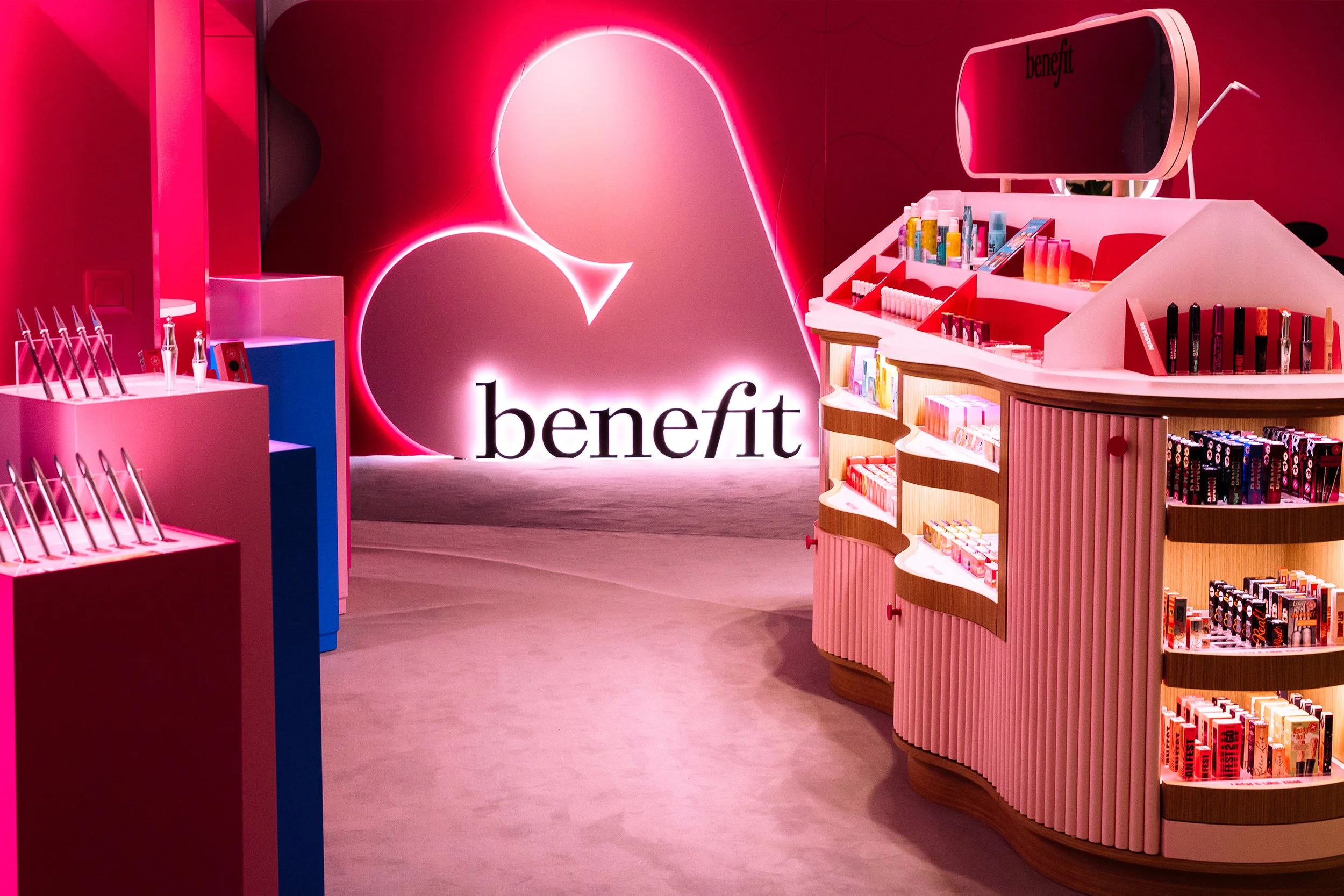
Benefit / LVMH.
Blazing new trails in beauty
Benefit was born in 1976 in San Francisco, originally called The Face Place, founded by twin sisters Jean and Jane Ford. From the start, the brand aimed to challenge convention and define beauty as whatever makes you feel good. That never-say-never spirit has made Benefit the world’s number one brow brand*, now part of luxury group Louis Vuitton Moët Hennessy, with over 3,200 locations in 50+ countries.
Despite decades of bestselling products, recent research showed many customers didn’t connect them with the Benefit name. The brand saw an opportunity to clarify its ethos, strengthen expression, and boost awareness in a competitive beauty market.
Working with Wolff Olins, Benefit’s leadership refined its core purpose: to Ignite Joy. Inspired by the playful irreverence of the Memphis Group, the refreshed identity keeps the best of Benefit’s visuals while modernising for today. Pink now has attitude, the logo can wink, and a cheeky graphic system nods to the brand’s founders.
The verbal identity is the Fun-Loving Beauty Genius - confident, knowledgeable, and always playful. The new Beneverse brings joy to every touchpoint, from standout packaging to immersive experiences, helping Benefit deliver radically feel-good beauty and reignite its trailblazing spirit worldwide.
See more here: wolffolins.com/work/benefit

Wolff Olins.
A brief for a designer to redesign their own brand is as challenging as it is complex.
I didn’t rebrand Wolff Olins out of vanity — I did it out of necessity.
When I joined it was obvious the agency brand needed a refresh which is no easy path in an agency that has been making iconic brands for 60 years. So I led a global refresh of our brand. Not just a new look, but a fundamental rethink and stragety. It’s been challenging, inspiring, and at times uncomfortable — exactly as it should be.
Because if we’re in the business of transformation, we have to walk that road ourselves. We don’t just advise change — we embody it. We live it.
And in a world that moves this fast, standing still is the fastest way to disappear. Even for brand agencies. Especially for brand agencies.
This new brand isn’t just how we show up — it’s how we move forward. How we keep ourselves honest. How we lead from the front. It was rated as the best agency rebrand for the last 10 years by industry.
Extra reading here:
creativeboom.com/news/wolff-olins-rebrand/